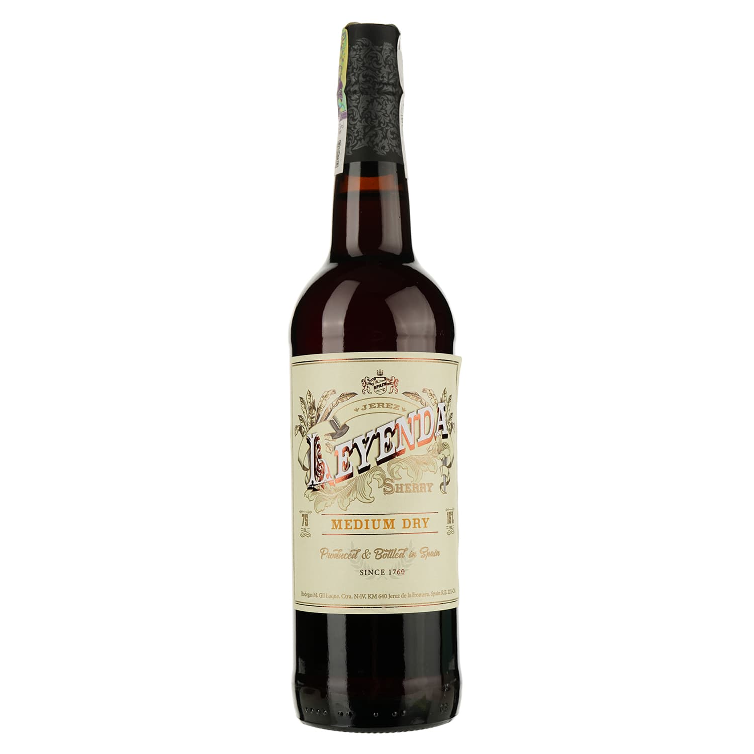
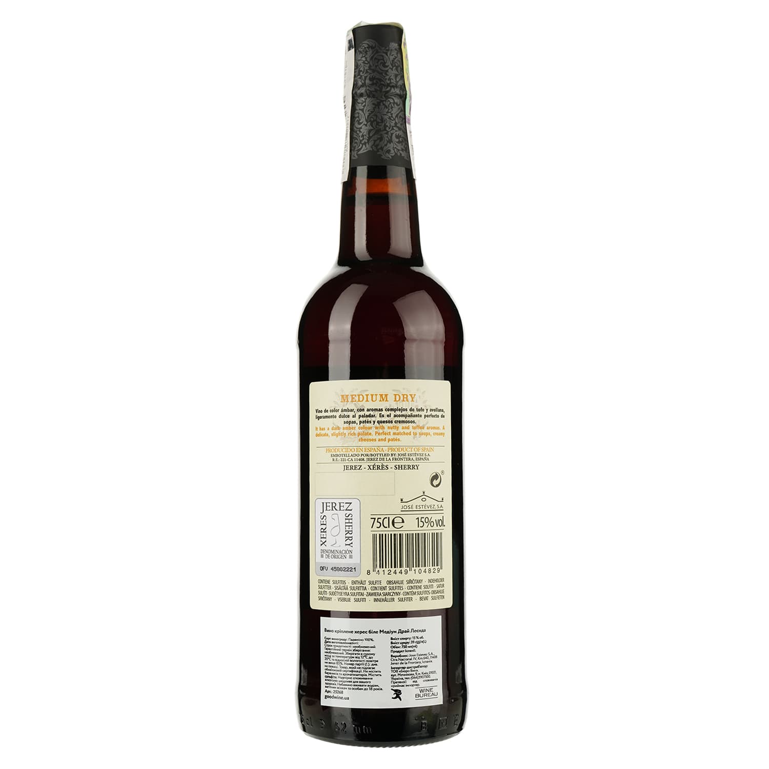
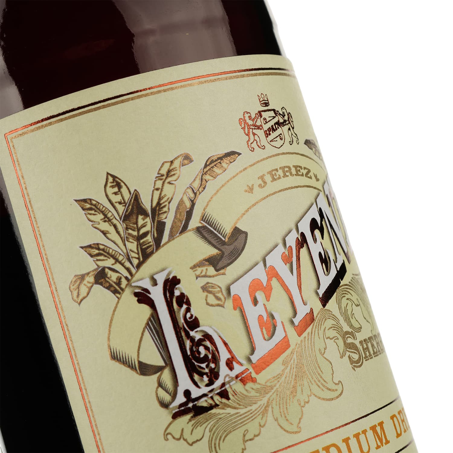
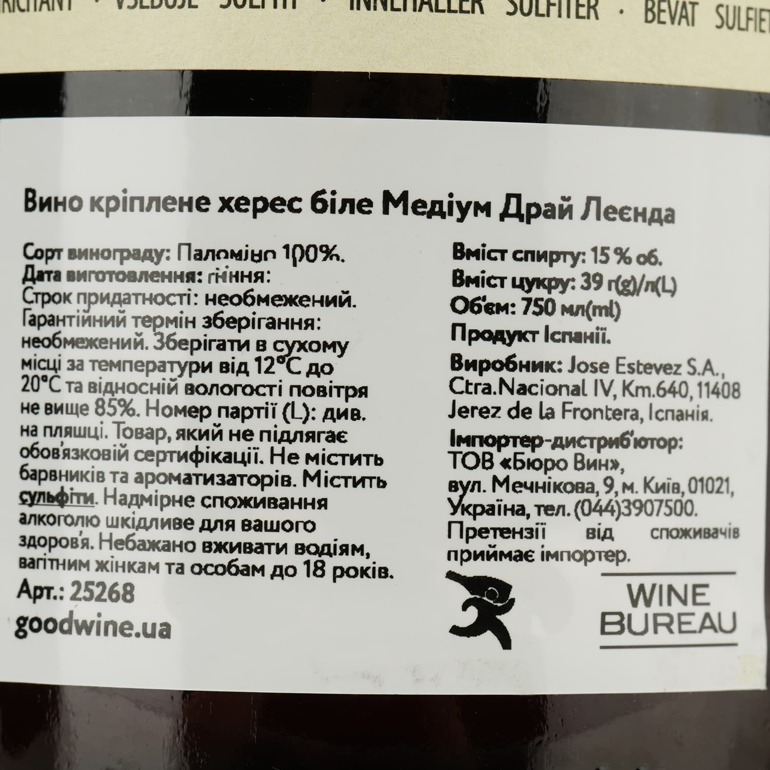
Вино Valdespino Leyenda Jerez Medium Dry, біле, напівсухе, 15%, 0,75 л
Valdespino, 15%, 0.75л
Ціни в магазинах України
Лише самовивіз
Ви можете забрати товар прямо в магазині. Це швидко і зручно. Просто прийдіть у зручний для вас час.
Оплата в магазині при отриманні
Цей сайт виступає посередником між покупцем і магазином. Він полегшує процес покупки, забезпечуючи зручний інтерфейс. Завдяки цьому користувачі можуть швидко знайти потрібні товари.
Придбати алкогольні напої можуть особи, які досягли 18 років. Надмірне вживання алкоголю шкодить вашому здоров’ю.
Ціни в магазинах
Ціни в магазинах
Характеристики
- Категорія
- Вино
- Виробник
- Valdespino
- Країна
- Іспанія
- Тип упаковки
- Скло
- Об'єм
- 0.75 л
- Міцність
- 15%
Про напій
@import url('https://fonts.googleapis.com/css2?family=Nunito:wght@400;500;600;700;800;900&display=swap'); body { font-family: Nunito; } img, video { max-width: 100%; height: auto; } .tab[data-v-d00b46dc]:not(:last-child) .tab-body, .tab[data-v-d00b46dc]:not(:last-child) h3 { border-bottom: none; } [data-v-429118b4] p:last-child { margin-bottom: 24px; } .tab[data-v-d00b46dc]:not(:last-child) .tab-body, .tab[data-v-d00b46dc]:not(:last-child) h3 { border-bottom: none; } [data-v-429118b4] p:last-child { margin-bottom: 24px; } .tab .content.description-content { padding-right: 0px !important; } .tab .content { padding: 0px !important; } .l-container { max-width: 960px; background-color: #fff; position: relative; overflow: hidden; } .l-section { width: 100%; display: -webkit-box; display: -ms-flexbox; display: flex; background-color: #fff; position: relative; } @media screen and (max-width: 768px) { .l-section { max-height: none; height: auto; } } .l-color-background-1 { background: #DDDAC7; } .l-color-background-2 { background: #EAE8D9; } .l-color-background-3 { background: #203928; } .l-color-background-4 { background: url(https://photo.maudau.com.ua/Landing/Valdespino_Leyenda_Jerez_Medium_Dry/bg4.webp); background-repeat: no-repeat; background-position: top center; background-size: cover; } .l-color-background-5 { background: #DDDAC7; } .l-color-background-6 { background: #E8D19F; } .l-color-background-7 { background: #191919; } .l-color-background-8 { background: #000; } .l-color-background-9 { background-color: #457b70; } .l-color-background-10 { background: url(https://photo.maudau.com.ua/Landing/Penasol_Sangria_1/bg1.webp); background-repeat: no-repeat; background-position: center; background-size: cover; } .logo-title-wrapper h2 { padding-left: 0 !important; font-size: 28px; } .l-half { width: 50%; position: relative; } @media screen and (max-width: 768px) { .l-half { width: 100%; height: 50%; } } .l-main-title { font-size: 29px !important; font-weight: bold; padding: 0; margin: 0; -webkit-box-flex: 1; -ms-flex: 1; flex: 1; } @media screen and (max-width: 768px) { .l-main-title { text-align: center; padding-bottom: 2.61%; padding-top: 2.61%; -webkit-box-flex: 1; -ms-flex: 1; flex: 1; } .l-img-padding2 { padding-bottom: 9px; padding-top: 20px; } } @media screen and (min-width: 481px) and (max-width: 768px) { .l-logo { padding-right: 15px; } } @media screen and (max-width: 480px) { .l-main-title { -webkit-box-flex: 0; -ms-flex: 0; flex: 0; font-size: 28px !important; } .l-logo { padding-right: 0px; } .l-main-title-color { text-align: center; } } .l-main-title-color { color: #000000; } .l-description { -webkit-box-sizing: border-box; box-sizing: border-box; display: -webkit-box; display: -ms-flexbox; display: flex; -webkit-box-align: center; -ms-flex-align: center; align-items: center; -webkit-box-pack: center; -ms-flex-pack: center; justify-content: center; -webkit-box-orient: vertical; -webkit-box-direction: normal; -ms-flex-direction: column; flex-direction: column; padding: 0 8.35%; height: 100%; } .l-description2 { -webkit-box-sizing: border-box; box-sizing: border-box; display: -webkit-box; display: -ms-flexbox; display: flex; -webkit-box-align: center; -ms-flex-align: center; align-items: center; -webkit-box-pack: center; -ms-flex-pack: center; justify-content: flex-start; -webkit-box-orient: vertical; -webkit-box-direction: normal; -ms-flex-direction: column; flex-direction: column; padding: 0 8.35%; height: 100%; } @media screen and (max-width: 768px) { .l-description, .l-description2 { text-align: center; } } .l-description-colorw { color: #fff; } .l-description-colorb { color: #000; } .l-title-colorw { color:#FFFCDE; } .l-title-colorb { color: #5E4400; } .l-title-colorc { color: #D89E3E; } .l-paragraph-colorb { color: #5E4400; } .l-paragraph-colorc { color: #F4E66B; } .l-paragraph-colorw { color: #EAE8D9; } .pb { padding-bottom: 40px; } .pb2 { padding-bottom: 50px; } .pb3 { padding-bottom: 40px; } .pt { padding-top: 40px; } .pt2 { padding-top: 50px; } .pt3 { padding-top: 30px; } @media screen and (max-width: 768px) { .pt, .pt2 { padding-top: 0; } .pt3 { padding-top: 0; } .pb, .pb2 { padding-bottom: 0; } .pb3 { padding-bottom: 30px; } } .l-title { font-size: 24px; padding: 0; margin: 0; margin-bottom: 4.1%; font-weight: 700; line-height: 1.25; width: 100%; text-align: left; } .l-title-h4 { font-size: 24px; padding: 0; margin: 0; margin-bottom: 4.01%; font-weight: normal; line-height: 30px; width: 100%; text-align: left; } @media screen and (max-width: 768px) { .l-title { margin-top: 30px; text-align: center; } .l-title-h4 { margin-top: 30px; text-align: center; } } @media screen and (max-width: 480px) { .l-title { font-size: 24px; line-height: 30px; } .l-title-h4 { font-size: 24px; } } .l-title-color { color: #000; } .l-title-color2 { color: #fff; } .l-paragraph { font-size: 15px; line-height: 1.5; font-weight: 400; padding: 0; margin: 0; } @media screen and (max-width: 768px) { .l-paragraph { margin-bottom: 30px; } } @media screen and (max-width: 480px) { .l-paragraph { font-size: 16px; } } .l-paragraph-color { color: #000; } .l-paragraph-color2 { color: #fff; } .l-img { max-width: 100%; -o-object-fit: cover; object-fit: cover; } .l-img-wrapper { display: -webkit-box; display: -ms-flexbox; display: flex; -ms-flex-wrap: wrap; flex-wrap: wrap; justify-content: center; } .l-img-wrapper2 { display: -webkit-box; display: -ms-flexbox; display: flex; -ms-flex-wrap: wrap; flex-wrap: wrap; justify-content: center; margin-top: 10%; } @media screen and (max-width: 768px) { .l-img-wrapper2 { flex-direction: column; align-items: center; } .l-img-wrapper2 img { width: 95%; margin-bottom: 5%; } .l-img-witdh5:last-child { margin-left: 0; } } .l-center { display: -webkit-box; display: -ms-flexbox; display: flex; -webkit-box-align: center; -ms-flex-align: center; align-items: center; -webkit-box-pack: center; -ms-flex-pack: center; justify-content: center; } @media screen and (max-width: 768px) { .l-center img { height: auto; } .l-paragraph-center, .l-description, .l-description2 { padding: 0 3% !important; } } .l-title-center { text-align: center; margin-top: 30px; margin-bottom: 2.01%; } .l-paragraph-center { text-align: center; padding: 0 8.35%; margin-bottom: 30px; } .l-flex { display: -webkit-box; display: -ms-flexbox; display: flex; -webkit-box-orient: vertical; -webkit-box-direction: normal; -ms-flex-direction: column; flex-direction: column; } .l-relative { position: relative; } @media screen and (max-width: 768px) { .l-section-reverse { -webkit-box-orient: vertical; -webkit-box-direction: reverse; -ms-flex-direction: column-reverse; flex-direction: column-reverse; } } @media screen and (max-width: 768px) { .l-column { display: -webkit-box; display: -ms-flexbox; display: flex; -webkit-box-orient: vertical; -webkit-box-direction: normal; -ms-flex-direction: column; flex-direction: column; } .m1 { width: 100%; } .product-cms__big-description { padding: 0 !important; } } @media (min-width: 800px) and (max-width: 940px) { .l-paragraph { font-size: 14px; line-height: 20px; } .l-title { font-size: 23px; margin-bottom: 2%; line-height: 26px; } .l-main-title { font-size: 23px !important; line-height: 26px !important; padding-bottom: 5px !important; } } @media (min-width: 769px) and (max-width: 799px) { .l-paragraph { font-size: 12px; line-height: 19px; } .l-title { font-size: 21px !important; margin-bottom: 2%; line-height: 26px; } .l-main-title { font-size: 23px !important; line-height: 26px !important; padding-bottom: 5px !important; } } .l-img-padding2 { padding-bottom: 30px; padding-top: 30px; } @media screen and (max-width: 768px) { .cut-img2 { margin: 0 0 5%; } .cut-img-bs { margin-bottom: 30px; } } .l-column-st { display: -webkit-box; display: -ms-flexbox; display: flex; -webkit-box-orient: vertical; -webkit-box-direction: normal; -ms-flex-direction: column; flex-direction: column; } .center-description-absolute { position: absolute; width: 100%; top: 0%; z-index: 2; } .l-description-st { -webkit-box-sizing: border-box; box-sizing: border-box; display: -webkit-box; display: -ms-flexbox; display: flex; -webkit-box-align: center; -ms-flex-align: center; align-items: center; -webkit-box-pack: center; -ms-flex-pack: center; justify-content: center; -webkit-box-orient: vertical; -webkit-box-direction: normal; -ms-flex-direction: column; flex-direction: column; padding: 0 8.35%; height: 100%; } @media screen and (max-width: 900px) { .l-description-st { text-align: center; padding: 0 3% !important; } .l-paragraph-center { text-align: center; padding: 0 8.35%; margin-bottom: 30px; } .l-background-main-img-1 { height: 69vw; background-size: cover; } } @media screen and (max-width: 768px) { .l-paragraph-center { padding: 0 3% !important; } } @media (max-width: 1240px) and (min-width: 1152px) { [data-v-429118b4] h3 { font-size: 16px; } [data-v-429118b4] p { font-size: 14px; } } @media (max-width: 950px) and (min-width: 769px) { [data-v-429118b4] h3 { font-size: 16px; } [data-v-429118b4] p { font-size: 14px; } } @media screen and (max-width: 768px) { [data-v-429118b4] p { font-size: 17px; } } @media screen and (max-width: 768px) { .rich-double-img-mb { margin-bottom: 16px; } } @media screen and (max-width: 1300px) { .l-title { font-size: 20px; } .l-paragraph { font-size: 14px; } } @media screen and (max-width: 1200px) { .l-title { font-size: 18px; } .l-paragraph { font-size: 13px; } } @media screen and (max-width: 1024px) { .l-title { font-size: 22px; } .l-paragraph { font-size: 15px; } } @media screen and (max-width: 900px) { .l-title { font-size: 20px; } .l-paragraph { font-size: 14px; } } @media screen and (max-width: 840px) { .l-title { font-size: 18px; } .l-paragraph { font-size: 14px; } } @media screen and (max-width: 768px) { .l-title { font-weight: 700; margin-bottom: 10px; } } .rich-padding-custom { padding: 0 0 0 8%; } .rich-padding-custom-2 { padding: 0 0 0 8%; } .rich-padding-custom-3 { padding: 0 0 4% 8%; } .rich-padding-custom-4 { padding: 0 8% 0 0; } .m3 { max-width: 101%; } .l-img-witdh3 { max-width: 50%; object-fit: contain; } .rich-productimg-desc { display: block; } .rich-productimg-mob { display: none; } @media screen and (max-width: 768px) { .rich-productimg-desc { display: none; } .rich-productimg-mob { display: block; } .m3 { max-width: 101%; } .rich-padding-custom, .rich-padding-custom-2, .rich-padding-custom-3, .rich-padding-custom-4 { padding: 0; } .l-img-witdh3 { max-width: 100%; object-fit: contain; } .l-img-wrapper.block-rew { flex-direction: column-reverse; } } .l-description-space { -webkit-box-sizing: border-box; box-sizing: border-box; display: -webkit-box; display: -ms-flexbox; display: flex; -webkit-box-align: center; -ms-flex-align: center; align-items: center; -webkit-box-pack: center; -ms-flex-pack: center; justify-content: center; -webkit-box-orient: vertical; -webkit-box-direction: normal; -ms-flex-direction: column; flex-direction: column; height: 100%; } .l-description-space .rich-d-wrapper { background: #DDDAC7; padding: 6% 8.35%; border-radius: 40px; } @media screen and (max-width: 768px) { .l-description-space { text-align: center; } .l-description-space .rich-d-wrapper { padding: 0 3%; border-radius: 0 0 40px 40px; } } Valdespino Leyenda Medium Dry Valdespino Leyenda Medium Dry – це виразне вино з ненав'язливою солодкістю та деревними нотами, створений з сорту Педро Хіменес, вирощеного в регіоні в Херес де Фронтера. Унікальність цього вина підсилюється додаванням до 5% інших сортів - Паломіно Фіно та Москато Бланко, що додають глибини смаку. Leyenda Medium Dry втілює в собі вишуканість та традиції іспанського виноробства. Смак наповнений традиціями Valdespino Leyenda Medium Dry захоплює своїм глибоким янтарно-золотистим кольором. В ароматі цього вина розкриваються різноманітні ноти: від горіхів до кураги, родзинок та тонких деревних відтінків, створюючи складний та привабливий букет. Смак добре збалансований, являє собою гармонію легкої солодкості та кислотності. Доповнюють цю картину дерев'яні нотки та тривалий посмак. Історія бренду Bodega Valdespino заснована у 1264 році, є однією з найстаріших та найпочесніших виноробних компаній Іспанії. Її засновник, Дон Альфонсо Вальдеспіно, був одним із 24 лицарів які підтримували короля у визволенні міста Херес від маврів. За свої заслуги він отримав землі з виноградниками. Вальдеспіно почали торгівлю у 1430 році, а їхній херес став улюбленим напоєм іспанської королівської родини. Вініфікація Valdespino Leyenda Medium Dry – це вишукане вино, виготовлене з винограду високоякісного сорту Педро Хіменес. Виноград для цього хересу вирощується у виноробному регіоні Херес де Фронтера, відомому своїми ідеальними умовами для виноградарства. Після процесу ферментації вино проходить витримку в дубових бочках протягом понад 5 років за методом "солера-криадера". Херес, що створює ідилію Valdespino Leyenda Medium Dry рекомендується подавати як аперитив, відкриваючи трапезу з вишуканої ноти. Це вино чудово доповнює страви з м'яса та дичини. Також, воно поєднується з іспанськими сирами, особливо Манчего, а також з ковбасами та оливками. Херес - це відмінний вибір для елегантних вечерь, зустрічей з друзями або сімейних обідів, де цінується якість та глибина смаку.
Відгуки
Ще немає відгуків. Будьте першим, хто залишить відгук.
Залишити відгук
AlcoPlace — агрегатор цін. Ми не продаємо товар і не приймаємо оплату: покупка відбувається безпосередньо в магазині, який ви обрали.
Умови повернення та обміну встановлює магазин-продавець згідно із Законом України «Про захист прав споживачів». Звертайтеся до магазину, де здійснили покупку.
Ціни на сайті оновлюються автоматично з даних магазинів і можуть відрізнятися від цін на касі. Остаточна ціна підтверджується магазином.